Mid-Century Modern Wall Art: A Guide
What actually counts as mid-century modern art, the six colors the style runs on, and how to frame and hang it without tipping into pastiche.

Mid-century modern wall art covers four families: geometric abstraction, biomorphic organic shapes, graphic travel and advertising posters, and stylized nature. All four run on the same restrained palette — mustard, burnt orange, teal, olive and walnut brown on cream or oatmeal — framed thin in oak or walnut, and hung sparsely.
What actually counts as mid-century modern
The period runs roughly from 1945 to 1969, and the art that belongs to it falls into four recognizable families.
Geometric abstraction. Flat planes, hard edges, circles and rectangles arranged with visible logic. Sparse, unshaded, and usually built from four or five colors at most.
Biomorphic shapes. The curved, amoeba-like forms of kidney tables and Noguchi coffee tables, translated into two dimensions: rounded blobs, boomerangs, and starburst motifs.
Graphic posters. Airline, ski resort and exhibition posters of the 1950s and 60s — bold flat color, heavy sans-serif type, minimal detail, and no photographic realism.
Stylized nature. Birds, leaves, fish and insects reduced to geometry and solid color rather than rendered naturalistically.
What unites them is not subject but treatment: flat color, clear edges, deliberate empty space. If a picture is soft-focus, heavily textured, or shaded with gradients, it is not mid-century modern however well its colors match.
| Style | Dates | Palette | Tell |
|---|---|---|---|
| Bauhaus | 1919–1933 | Primary red, blue, yellow, black | Grid discipline, theory-led, no whimsy |
| Mid-century modern | 1945–1969 | Mustard, orange, teal, olive, walnut | Warm, optimistic, organic curves allowed |
| Scandinavian | 1950s–now | White, pale wood, black, one muted accent | Cooler, lighter, far less saturated |
| Art Deco | 1920s–1930s | Black, gold, jade, cream | Symmetry, metallics, stepped ornament |
| Memphis / postmodern | 1980s | Hot pink, cyan, lemon, black squiggle | Clashing color, deliberate disorder |
The palette: six colors and one ground
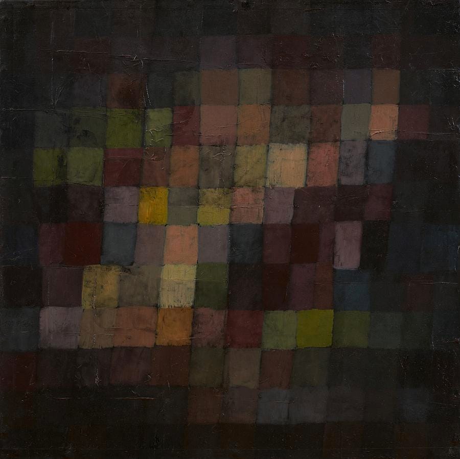
Klee painted this two decades before the mid-century period began, but the palette is the direct ancestor of it: ochre, olive, russet and umber laid down as flat squares, held together by a dark ground. Mid-century designers brightened those colors and kept the discipline.
| Color | Approx. hex | Role | Pairs best with |
|---|---|---|---|
| Mustard / harvest gold | #d4a02c | Primary accent | Teal, charcoal, walnut |
| Burnt orange | #c0561f | Primary accent | Teal, cream, olive |
| Teal / turquoise | #2f8a8a | Cool counterweight | Mustard, orange, oatmeal |
| Avocado / olive | #6f7a35 | Secondary | Walnut, cream, mustard |
| Walnut brown | #6b4a2f | Anchor | Everything; supplies the wood note |
| Charcoal | #33322e | Line and edge | Everything; never use pure black |
| Oatmeal / cream | #efe6d4 | Ground | The field the others sit on |
Two rules make this palette work. First, use three of these colors, not six — the mid-century look is restraint, and a print carrying the whole list reads as a novelty. Second, keep the ground warm: mustard and burnt orange on a pure white ground turn brash, while the same colors on oatmeal look considered.
Geometry, and how much of it to use
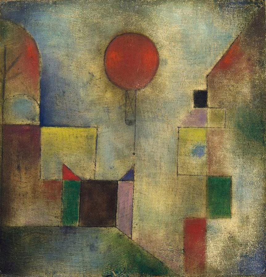
Red Balloon shows the structure that mid-century abstraction returned to again and again: a field of muted rectangles, then one saturated shape that the eye goes to first. It works because the accent is small. Enlarge the red circle to half the canvas and the composition collapses.
The same proportion governs a mid-century room. Give the wall one dominant neutral, one supporting color and one hot accent — usually orange or mustard — and let the accent occupy a minority of the surface. A useful working ratio is 60% ground, 30% secondary, 10% accent.
Scale matters as much as color. Mid-century interiors are horizontal: long low sofas, low sideboards, wide windows. Landscape-format art and wide diptychs reinforce that line; tall portrait pieces fight it. If you have one long wall, a single wide work or a horizontal row of three at equal height will always look more correct than a scattered cluster.
What fails in a mid-century room
Photographic realism. A soft-focus landscape photograph in mid-century colors is still not mid-century. The style is about flat color and drawn edges; gradients and depth of field belong to a different vocabulary.
Memphis colors mistaken for mid-century. Hot pink, cyan and lemon with black squiggles are 1980s postmodernism, three decades later and philosophically opposed. If a print looks cheerful in a chaotic way, it is Memphis.
Ornate frames. Carved gold, swept mouldings and wide ornamented profiles undo the whole thing. Mid-century framing is a thin flat strip of wood and nothing else.
Too many pieces. Dense salon-style gallery walls are the opposite of this style. Empty wall is part of the composition — one or two pieces per wall, generously spaced.
Greige. Prints in taupe, oyster and pale gray read as 2015 rental-flat neutral, not 1958. Mid-century color is saturated and warm; if a palette has had the life drained out of it, it belongs to another decade.
Pure white mats. Use cream or oatmeal instead. A bright white mat against warm wood and warm paint looks like an office.
Framing, hanging and where to put it
Frames. Thin profiles, 0.5 to 1 inch wide, in white oak, teak or walnut. Black is acceptable for graphic posters and photography. Avoid anything wider than about 1.5 inches, and avoid metallics apart from a narrow brushed brass on a dark print.
Mats. Cream or oatmeal, 2 to 3 inches. Or skip the mat entirely — a poster floated in a thin wooden frame with no border is very much of the period.
Height. The usual 57 to 60 inch center line applies, but mid-century sofa and sideboard backs sit lower than modern ones, so the center often lands nearer 56 to 58 inches once you keep the standard 6 to 10 inch gap above the furniture. Trust the gap over the number.
Groupings. If you hang more than one piece, align them on a shared horizontal axis and space them widely — 4 to 6 inches between frames rather than the 2 to 3 inches used in a dense gallery wall. Mid-century arrangements read as a sequence, not a mosaic.
Format. Posters and framed prints suit the graphic families best. For abstraction, a gallery-wrapped canvas with no frame at all sits comfortably in a mid-century room, because the unbroken edge matches the plain planes of the furniture.
Frequently asked questions
What is mid-century modern wall art?
Art from roughly 1945 to 1969, or made in that idiom: geometric abstraction, biomorphic organic shapes, graphic travel and advertising posters, and stylized nature. It is defined by flat color, hard edges and deliberate empty space rather than by subject matter, and it runs on a warm palette of mustard, burnt orange, teal, olive and walnut.
What colors are mid-century modern?
Mustard or harvest gold, burnt orange, teal, avocado green and walnut brown, sitting on a cream or oatmeal ground with charcoal for line work. Use three of them at a time rather than all of them. Keeping the ground warm rather than pure white is what separates the real thing from an imitation.
Is Bauhaus the same as mid-century modern?
No. Bauhaus ran from 1919 to 1933 in Germany and used primary red, blue and yellow with black on a strict grid. Mid-century modern is post-war, mostly American, warmer in palette and looser in form — it allows organic curves and optimistic color that Bauhaus theory would have rejected. The two are related, not interchangeable.
What frames suit mid-century modern art?
Thin flat profiles, half an inch to an inch wide, in white oak, teak or walnut, with a cream mat or no mat at all. Black suits graphic posters and photography. Avoid ornate mouldings, wide profiles and gold leaf, all of which contradict the plain surfaces the style depends on.
How many pieces should I hang in a mid-century modern room?
One or two per wall, with generous space around them. Empty wall is part of the composition in this style, so dense salon-hung gallery walls work against it. If you do group pieces, align them on one horizontal axis and leave 4 to 6 inches between frames rather than the tighter 2 to 3 inches used elsewhere.
What art should I avoid in a mid-century modern room?
Soft-focus photography, heavily textured or gradient-shaded work, 1980s Memphis colors mistaken for mid-century, ornate gilt frames, and washed-out greige prints. Anything that hides its edges or drains its color is working against a style built on flat, saturated planes with clear boundaries.
Start with mid-century modern art and its close relations — Bauhaus, geometric and abstract work. Order graphic pieces as art or in thin-profile framed prints with a cream mat, and abstraction as a gallery-wrapped canvas with no frame at all.