Black-and-White Photography for the Home
Monochrome is the one kind of photography that never fights a room. The three tonal keys, which finish to buy, and the framing rule that makes it look deliberate.

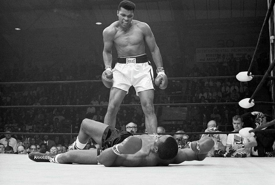
Black-and-white photography works in a home because it adds structure without committing the room to a color. Match the tonal key to the room — high key for bedrooms and small spaces, full range for a main living wall, low key for corridors and dining rooms — then frame in black with a generous white mat, and buy a size larger than feels comfortable.
Why monochrome never fights a room
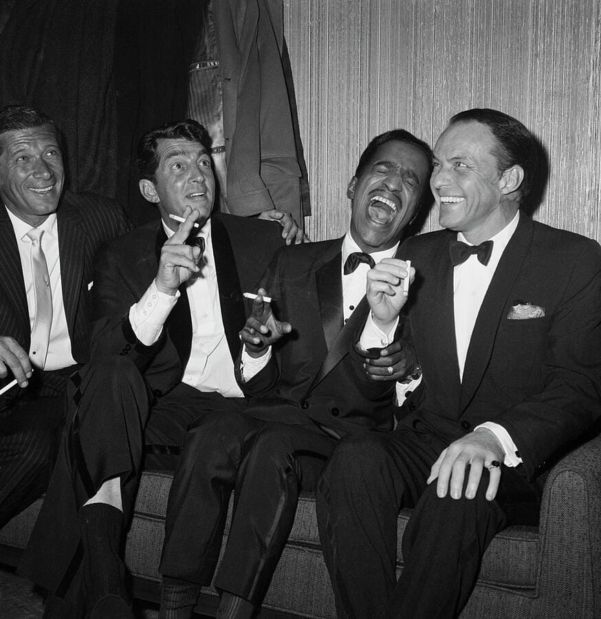
A color photograph commits a wall to a palette. Hang a saturated blue seascape and every cushion, rug and lampshade in the room is now in a relationship with it, whether you intended that or not. A black-and-white photograph makes no such demand. It contributes tone, contrast and structure, and leaves the color decisions to the furniture.
The perceptual reason is that removing color removes the first thing the eye reaches for. What is left is composition — line, mass, light, texture — which is why monochrome reads cleanly from across a room, and why it carries a formality color work has to work much harder for.
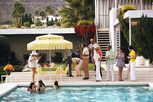
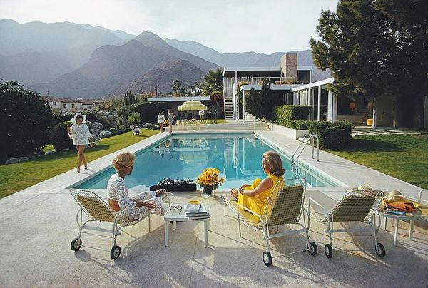
The formality is partly historical accident. For most of the twentieth century serious photography simply was black and white; color belonged to advertising and holiday snapshots. That changed when John Szarkowski gave William Eggleston a solo show of color prints at the Museum of Modern Art in 1976 — the museum’s first — and the critics savaged it. The convention has broken down since, but the association it left behind is still working on your wall.
The three tonal keys, and where each belongs
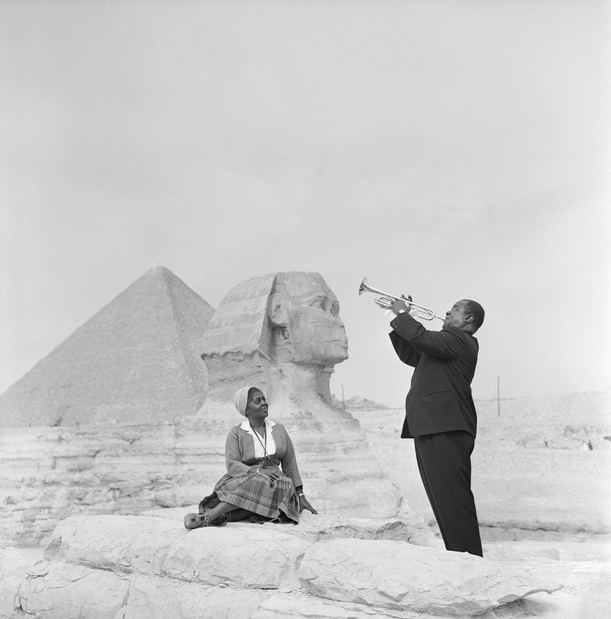
The most useful thing to know about a black-and-white photograph, before subject or photographer, is where its tones sit. Almost every monochrome image falls into one of three keys, and each behaves differently in a room.
High key. Tones concentrated in the light end — fog, snow, white walls — with only a small dark accent for anchor. High-key images recede, expand a space and calm it. They suit bedrooms, bathrooms, small rooms and north-facing rooms already short of light, and they are the only monochrome that reliably works on a dark-painted wall.
Full range. True black to paper white with the whole spread of mid-tones between — the classic landscape and documentary look. These carry a main wall on their own. They need a well-lit room, space around them, and size.
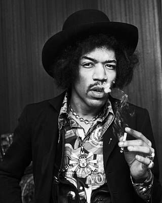
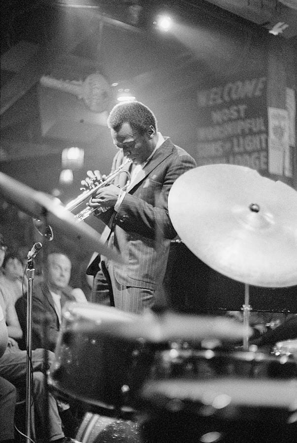
Low key. Tones packed into the dark end with a few small highlights doing all the work — jazz portraits, night streets. Low-key images advance and enclose. They suit corridors, stairwells and dining rooms: rooms used in the evening under warm artificial light, where a full-range print looks flat and a high-key one glares.
Mixing keys on one wall is the commonest way a monochrome grouping goes wrong. Pick a key, hang three or four in it, and let one contrasting piece elsewhere in the room do the arguing.
Finish: what each surface does to the blacks
Monochrome is far more sensitive to print surface than color work, because the whole image is carried by the distance between the deepest black and the brightest white. Surfaces hold that distance very differently.
| Finish | What it does to the blacks | Best for | Watch out for |
|---|---|---|---|
| Matte fine-art paper | Blacks read as deep charcoal, not true black; long smooth gradations | High-key work, bright rooms | Soft if the image needs punch |
| Satin or luster paper | Deeper black, mild sheen, good shadow detail | The safe default | Slight oblique reflection |
| Acrylic face-mount | Deepest apparent black, most contrast; the gallery standard | Low-key and full-range work | Glare opposite a window |
| Metal | Deep blacks, faint cool cast, hard luminous surface | Architecture and graphic images | Clinical for portraits |
| Canvas | Weave interrupts tonal transitions and lifts the blacks | Rarely right for photography | Skies and skin lose gradation |
One rule from the table: canvas is the wrong material for a photograph. The texture destroys exactly the smooth tonal gradients that make a monochrome print worth looking at. Use framed prints for most rooms and acrylic where you want the contrast pushed.
Framing: black frame, white mat, and be generous
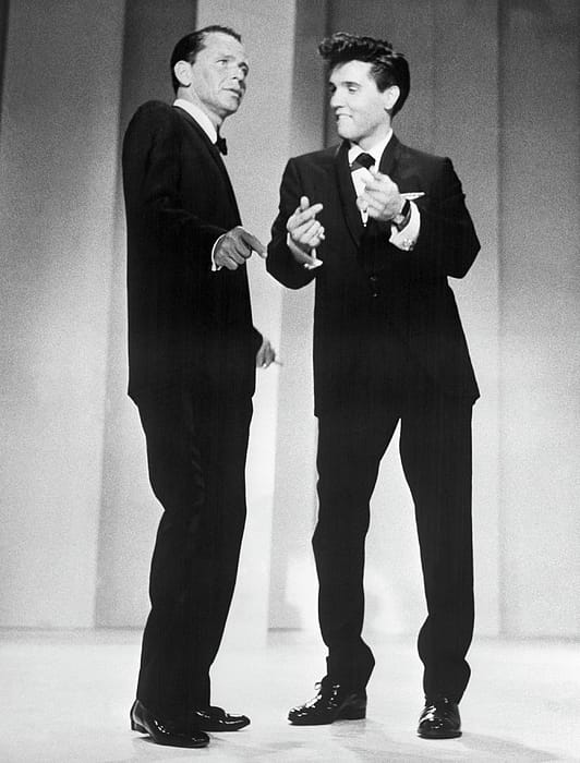
Black-and-white photography has a house style, and unlike most house styles it is worth following almost without exception.
A wide white mat. The mat is structural, not decorative. A color photograph separates itself from the wall by hue; a monochrome one cannot, so the mat supplies the gap. Under 2.5 inches it stops reading as intentional; over 30 inches, go wider still.
A black frame, narrow and square. Half an inch to an inch of face width. Black picks up the darkest tones in the image and closes the composition. Wood works for warmer rooms, matte black metal for cooler ones.
Glazing. Photographic prints need glass; the surface is fragile and monochrome shows every mark. Anti-reflective glass is worth the extra on anything over 24 inches, especially opposite a window.
Absolute consistency across a group. Identical frames, identical mat widths, 2 to 3 inches between them. Variation in a monochrome group reads as a mistake rather than eclecticism, because there is no color to distract from the geometry.
Where it goes, and how to mix it with color
Monochrome earns its place in specific rooms, for specific reasons.
- Stairwells and corridors. The best place in the house for it: transitional spaces seen close up and in motion, usually with poor light, where low-key photography beats anything else you could hang.
- Home offices and studies. Structure without distraction, on a wall you look at while thinking about something else.
- Bedrooms. High-key only. Full-range and low-key work is too assertive for a room whose main function is to be restful.
- Kitchens and dining rooms. Monochrome tolerates a busy visual environment — appliances, tiles, cabinetry — far better than color art.
- Above a sofa. One large full-range piece, roughly two-thirds the width of the sofa. See our guide to how high to hang art above a sofa for the measurements.
On mixing with color work: cluster, do not scatter. A monochrome piece dropped into a colorful gallery wall looks like a gap. Give it a whole wall, a corridor, or a defined block within a larger arrangement, and it reads as a deliberate change of register.
Finally, size. Monochrome is the genre people most consistently buy too small, because it looks complete in a thumbnail. Grain, tonal gradation and shadow detail need physical size to exist — 30 inches on the long edge is a reasonable floor.
Frequently asked questions
Why does black-and-white photography work so well in interiors?
Because it adds structure without committing the room to a color scheme. A color photograph forces every other object into a relationship with its palette; a monochrome one contributes only tone and contrast. It also reads more cleanly at a distance, since removing color leaves composition as the first thing the eye finds.
What is the difference between high key and low key photography?
High key means the tones are concentrated at the light end — fog, snow, white walls — with only a small dark accent. Low key means they are packed into the dark end with a few small highlights. High-key images expand and calm a space; low-key images enclose it and suit rooms used in the evening.
Should black-and-white photographs be matted?
Yes, and generously — a generous white mat, wider still on large prints. A color photograph separates itself from the wall by hue, but a monochrome one cannot, so the mat supplies that visual gap. Anything narrower than about 2.5 inches stops looking deliberate.
Is matte or gloss better for black-and-white prints?
Satin or luster is the safe default. Matte paper gives long smooth gradations but its blacks read as deep charcoal rather than true black. Acrylic and metal give the deepest blacks and the most contrast, at the cost of glare. Choose matte for bright rooms and acrylic for low-key images.
Can you print black-and-white photography on canvas?
You can, but it is usually the wrong choice. Canvas texture interrupts the smooth tonal transitions that carry a monochrome image, and it lifts the blacks so the print loses contrast. Skies, skin and shadow detail suffer most. Use paper, acrylic or metal for photographs.
How do you mix black-and-white art with color art?
Cluster rather than scatter. A single monochrome piece dropped into a colorful gallery wall reads as a gap. Give black-and-white its own wall, its own corridor, or a clearly defined block within a larger arrangement, and it registers as a deliberate change of key instead of an omission.
Start with black-and-white photography and narrow by subject from there, or go straight to black-and-white framed prints in sizes up to 72 inches. If you want a place to begin, two of the strongest bodies of monochrome work anywhere are Ansel Adams’ landscapes and the music photography archives.