Maximalist Walls: Color, Pattern and Density
Density only works when something governs it. The coverage figures, the repeated-color rule and the frame discipline that separate a maximalist wall from a cluttered one.

A maximalist wall is density with a governing rule, not an absence of rules. Cover 60 to 75 percent of the wall, drop spacing to 1.5 to 2 inches, repeat one color through at least two-thirds of the pieces, and keep frames to two or three families. That discipline is the whole difference between rich and cluttered.
Density, and the number that governs it
Coverage is the measurable difference between the three ways of hanging a wall. A sparse wall gives about 15 percent of its surface to framed work; a conventional one around 40 percent; a maximalist wall 60 to 75 percent. Below 50 percent the effect reads as a busy but ordinary gallery wall; above 80 percent the wall color stops registering and the arrangement loses its ground.
Spacing follows. Conventional gallery walls use 2 to 3 inches between frames; a maximalist arrangement tightens to 1.5 to 2 inches, and nineteenth-century salon hangs went tighter still. Tight spacing is what makes a group read as one object; loose spacing at high density is the actual definition of clutter.
Two mechanics follow. Keep the outer edge of the arrangement to a clean rectangle or arch — the eye forgives internal chaos if the silhouette is regular. And align one continuous line through the group: a shared horizontal at eye level, or a vertical down one side.
Building a maximalist palette
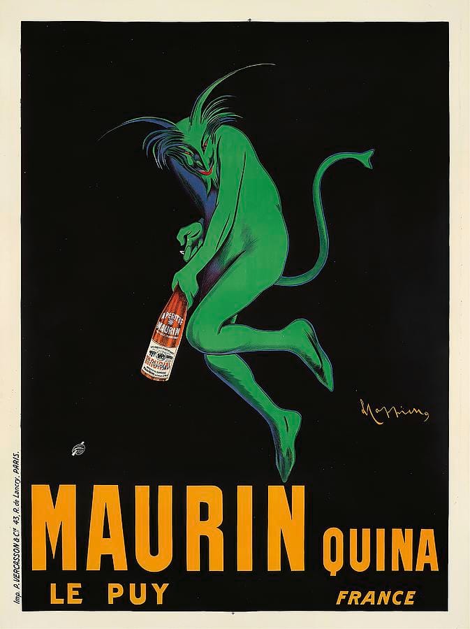
Cappiello’s poster is the maximalist unit in its purest form: a dark ground, one violently saturated color, no detail. Bold color survives a crowded wall only when each piece is simple. Six complicated multi-color prints cancel out; six simple loud ones amplify.
The governing rule is the repeated color. Pick one hue and make sure it appears in at least two-thirds of the pieces, at any size — a strip of gold, a red border, a black mass. That thread is what the eye follows, and why an apparently random Victorian salon wall still looks coherent.
| Scheme | Wall | Art palette | Repeat | Fails with |
|---|---|---|---|---|
| Jewel box | Emerald or oxblood, gloss | Gold, jade, ruby, ink blue | Gold | Pastels, greige, raw wood |
| Dark academia | Ink blue or near-black | Sepia, brass, oxblood, ivory | Sepia | Neon, cool gray, white frames |
| Botanical / chinoiserie | Patterned paper | Green, coral, cream, black | The paper’s ground color | A second floral at the same scale |
| Poster wall | White or a hot flat color | Primary red, yellow, blue, black | Black | Muddy earth tones, sepia |
| Grand-millennial | Rose, chintz, stripe | Rose, sage, gilt, cream | Cream | Industrial black, chrome, concrete |
Every entry in the “fails with” column is a color family that neither matches the thread nor contrasts hard enough to read as a deliberate shock. Maximalism tolerates clashes; it does not tolerate near-misses.
Pattern on pattern: the scale rule
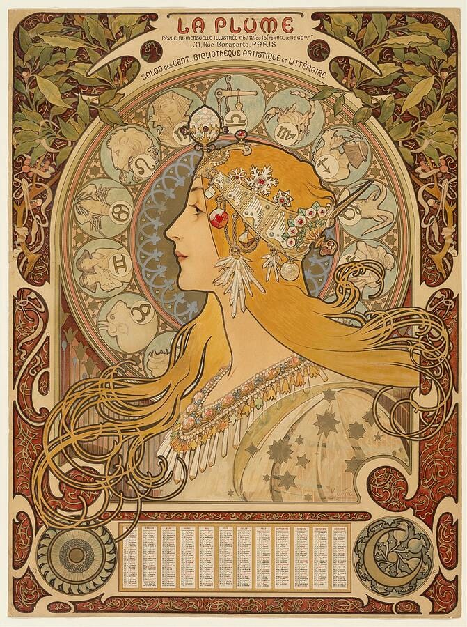
Mucha’s panel is dense to the point of horror vacui and still reads clearly, because the ornament works at three scales: a large dominant motif in the zodiac halo, a mid-scale rhythm in the coiling hair, a fine texture in the border. Nothing competes, because nothing is the same size as anything else.
Use the same ratio on a wall. Hanging art against patterned wallpaper, or mixing several patterned works, aim for one large-scale pattern, one mid-scale, one small-scale, and let the large one dominate. Two patterns at the same scale vibrate against each other however well their colors agree.
Against busy wallpaper, three approaches work. A single very large piece that overrides the paper. A dense block of small pieces that becomes its own texture. Or art with a solid ground — a poster, a dark portrait, a flat-color abstract — so each frame gives the eye somewhere to rest. What fails is a handful of medium, medium-busy pieces, which disappear into the paper.
Frames: the two-family rule
Mixing frames is expected, but not infinitely. Restrict yourself to two or three frame families and repeat each several times across the wall — gilt and black, walnut and brass, or gilt and black with one outlier. Twenty frames in twenty finishes read as a junk shop; the same twenty in three read as a collection.
Practical decisions that follow:
- Vary width, not just color. Alternating a wide ornate molding with a thin plain one prevents the wall reading as a single texture.
- Repeat the outliers. If one frame is an odd finish, put a second of the same finish elsewhere. One of anything looks like a mistake; two looks like a decision.
- Mats are optional and often unhelpful. Wide mats waste surface you are trying to fill; where you use one, keep the color identical throughout.
- Mix media deliberately. A mirror, a plate, a small textile — three-dimensional objects among the frames are a maximalist signature.
On mounting: lay the arrangement out on the floor, photograph it from overhead, then cut paper templates and tape them up. With forty pieces, improvising on the wall is not viable.
What fails on a maximalist wall
No repeated thread. Density without a shared color or frame family is just accumulation — the single failure that sinks most attempts.
A ragged outer edge. A silhouette that drifts in and out looks unfinished regardless of what is in it. Keep the outer boundary rectangular.
Everything at one scale. Twelve identical frames make a grid, not a maximalist wall. You need a dominant piece — roughly twice the average area — plus a range of smaller ones around it.
Near-miss colors. Maximalism absorbs a genuine clash; it cannot absorb a slightly-wrong pink or a not-quite-matching green. When in doubt, go further away, not closer.
Detail everywhere. If every piece is intricate the wall becomes noise. Roughly a third should be simple — flat color, a dark ground, plain typography — so the eye can pause.
Timid coverage. Stopping at 45 percent is the worst of both worlds — too busy to be calm, too sparse to be a statement. Commit, or hang one piece.
Ignoring the room’s edges. Run the arrangement to within 4 to 6 inches of a door casing, corner or ceiling and it looks confident. Leave 15 inches of awkward wall and it looks like you ran out of art.
Frequently asked questions
How much of a wall should art cover in a maximalist room?
Between 60 and 75 percent of the wall surface, compared with about 40 percent on a conventionally decorated wall and 15 percent on a sparse one. Below half the effect reads as a merely busy gallery wall rather than a deliberate one; above about 80 percent the wall color stops registering and the group loses its background.
How do you make a gallery wall look intentional rather than messy?
Three things do most of the work. Repeat one color through at least two-thirds of the pieces. Keep the outer edge of the whole arrangement to a clean rectangle. And align one continuous line through the group — a shared horizontal at eye level or a shared vertical down one side. Internal variety is then free.
Can you mix frame colors on a gallery wall?
Yes, but restrict yourself to two or three finishes and repeat each of them several times across the wall — gilt and black, or walnut and brass, or gilt with black and one outlier used twice. Twenty frames in twenty finishes read as a junk shop. The same twenty in three finishes read as a collection.
How do you mix patterns without clashing?
Vary the scale. Use one large-scale pattern, one mid-scale and one small-scale, and let the large one dominate. Two patterns of the same scale will vibrate against each other however well their colors agree. Keeping a color common to all of them makes the combination read as deliberate.
What art works on patterned wallpaper?
One very large piece that overrides the paper, a dense block of small pieces that becomes its own field of texture, or work with a solid ground — posters, dark portraits, flat-color abstracts — so each frame gives the eye a place to rest. A handful of medium, medium-busy pieces will simply disappear into the pattern.
How far apart should frames be on a maximalist wall?
One and a half to two inches, tighter than the two to three inches used on a conventional gallery wall. Close spacing is what makes many frames read as a single object. Wide spacing at high density is the actual definition of clutter, so if you are hanging densely, commit to the tight gaps.
Density needs volume, and cheaply. Build the wall from art and framed prints in mixed sizes, browse maximalist, Art Nouveau and pattern work for the ornate end, and consider a canvas as the dominant large-scale piece the arrangement needs.