Japandi and Quiet Minimalism
The narrow palette, the value discipline and the one dark accent that make a quiet room work — plus how it differs from plain Scandinavian minimalism.

Japandi art works on a narrow, warm palette — oatmeal, bone, clay, warm gray and black on pale wood — with everything held close in tone. Keep the artwork’s ground within two value steps of the wall, allow one genuinely dark accent per room, and hang one or two pieces per wall rather than a group.
What Japandi actually is
Japandi is a recent portmanteau — Japanese plus Scandinavian — for a style combining two older ideas. From Japan it takes wabi-sabi, the acceptance of imperfection and age, and ma, the deliberate use of empty space. From Scandinavia, pale wood, functional simplicity and a warmth that stops the result feeling austere.
The practical consequence is worth stating plainly: in this style the empty wall is part of the composition. Art is not there to fill space but to give it a focal point. That idea explains most of the rules below.
| Style | Palette | Contrast | Art density |
|---|---|---|---|
| Japandi | Oatmeal, clay, warm gray, black, pale wood | Low, with one dark accent | 1–2 pieces per wall |
| Scandinavian | White, pale wood, black, one bright accent | Low to moderate | 2–4, often a small grid |
| Wabi-sabi | Earth, ash, undyed linen, rust | Very low; texture over tone | 1 piece, often unframed |
| Plain minimalism | White, gray, black | High and graphic | 1 large piece |
The difference from Scandinavian design is temperature. Scandinavian interiors run cool and bright — chalk walls, a clean primary accent. Japandi runs warm and dim: undyed paper, linen, clay, no bright color anywhere.
The palette, and the value discipline behind it
Color is the easy part: oatmeal (#e6ddcd), bone (#f0ece2), warm gray (#a8a294), clay (#b58e72), umber (#6b5a48) and a soft black (#231f1c). No saturated hue appears at all — which is why Japandi rooms are so easy to get wrong. With no color doing the work, value has to.
The ladder above sets the discipline. Put your wall at step 8 or 9 and the artwork’s paper or ground at step 7: close, but not identical. Any wider a gap and the piece starts to shout; any narrower and it disappears. The drawing itself — the branch, the figure, the line — sits around steps 5 and 6, and exactly one element in the room reaches step 2. That is the anchor.
Two consequences follow. A uniformly mid-toned work will not hold a Japandi wall; it needs the dark note. And a bright white ground is wrong even though white is a neutral — on warm oatmeal it reads as a hole. Cream, ivory and unbleached paper are the correct grounds.
What to hang
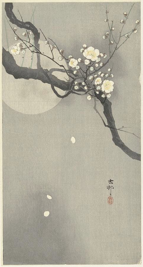
Koson’s print is close to a specification for the style. A single branch enters from one side, a pale moon sits behind it, and more than half the sheet is left as flat gray-green ground. Nothing is centered, and the emptiness is as much the subject as the blossom.
Subjects that work on the same principle:
- Japanese woodblock prints — kachō-e bird-and-flower studies especially: one motif against open ground.
- Sumi-e and ink wash — one gesture, one tone, enormous margins.
- Line drawings — a continuous-line figure or a botanical contour, printed dark on cream.
- Photography of a single object — a vessel, a stone, a stretch of sand, in soft light.
- Textile and paper works — undyed linen, washi, or anything where the texture is the content.
- Tonal abstracts — two or three close values, no hard edges.
Vertical formats suit the style unusually well, because a tall narrow piece leaves generous wall on either side. A single vertical print on a wide wall is very Japandi; the same wall filled edge to edge is not.
The one dark accent, and how much wall to leave
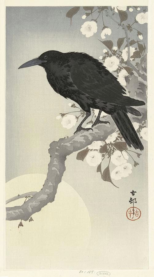
Every quiet room needs one genuinely dark thing, and it should be small. Koson’s crow occupies perhaps a tenth of the sheet, and it is the only reason the print has any tension. Remove it and you have a pleasant gray rectangle.
In a room that anchor might be the artwork, a black frame or a dark ceramic. What matters is that there is exactly one. Two or three competing dark objects turn a calm room into an ordinary one.
On quantity and scale, the numbers that work:
- One or two pieces per wall. Three is one too many.
- Roughly 15 to 25% wall coverage, against the 40% or more a conventionally decorated room carries.
- Go large rather than multiple. One piece at two-thirds the width of the furniture beats three small ones.
- Leave one wall entirely empty. Hanging nothing on one wall of four is a deliberate move, not an oversight.
If you group pieces, hang two of identical size as a pair with a wide gap — 6 to 8 inches, not the tight 2 to 3 inches of a gallery wall — so they read as two quiet statements rather than a block.
What fails, and how to frame and print it
Saturated color. One bright hue undoes the scheme. If you want color, take the most muted version — clay rather than terracotta, ash green rather than sage, dust rose rather than pink.
High-contrast graphic prints. Bold black-and-white geometry belongs to plain minimalism, a colder style. Japandi contrast is soft-edged.
Gray on gray with nothing dark. The commonest failure: gentle mid-tones with no anchor read as unfinished, not calm.
Dense gallery walls. Whatever the palette, a wall of nine frames is the opposite of this style.
Reflective surfaces. Gloss acrylic and mirror-finish metal contradict the matte, aged quality the style depends on. Choose matte paper, canvas or wood.
Frames. Thin natural wood — white oak, ash, birch, light maple — or soft matte black, in a profile under an inch. Use a generous 3 to 4 inch mat in cream or unbleached linen rather than white, or none at all: a print floated on a backing board with its deckled edges showing suits the style better than any frame.
Hanging height. The standard 57 to 60 inch center line applies, but quiet rooms often benefit from dropping nearer 55 inches above low seating. Low furniture wants low art.
Frequently asked questions
What is Japandi style?
Japandi combines Japanese wabi-sabi — the acceptance of imperfection and the deliberate use of empty space — with Scandinavian pale wood and functional simplicity. In practice it means a warm, low-contrast palette of oatmeal, clay, warm gray and black, natural materials, and very few objects, each given room to be seen.
What art goes in a Japandi room?
Japanese woodblock prints, sumi-e ink wash, single-line drawings, photographs of one object in soft light, textile and paper works, and tonal abstracts. All share one structure: a single motif against a large area of quiet, warm ground. Vertical formats suit the style particularly well because they leave generous wall on either side.
What is the difference between Japandi and Scandinavian style?
Temperature and contrast. Scandinavian interiors are cool and bright — chalk white walls, pale wood, one clean bright accent, and often a small grid of prints. Japandi is warmer and dimmer: unbleached paper, clay, undyed linen, no bright color at all, and fewer pieces hung with much more space around them.
What colors are Japandi?
Oatmeal, bone, warm gray, clay, umber and a soft black, on a base of pale wood. No saturated hue appears. Because no color is doing the work, lightness has to: keep the wall and the artwork’s ground within two steps of each other on a nine-step value scale, and let exactly one element in the room be genuinely dark.
How many pieces of art should a minimalist room have?
One or two per wall, covering roughly 15 to 25 percent of the wall — against the 40 percent or more that a conventionally decorated room carries. One large piece beats three small ones. Leaving one wall in the room entirely empty is a deliberate part of the style rather than an omission.
What frames work for Japandi art?
Thin natural wood — white oak, ash, birch or light maple — or a soft matte black, in profiles under an inch wide. Use a wide mat of 3 to 4 inches in cream or unbleached linen, never bright white. A print floated on a backing board with its deckled edges showing suits the style better than any frame.
Start with Japandi, wabi-sabi and minimalist work, or go to the source with Japanese woodblock prints and sumi-e ink wash. Print on matte paper as a framed print with a wide cream mat, or on canvas for a softer, textile-like surface — and skip gloss entirely.