How to Choose a Frame and Mat
Mat width does more than molding does. The defaults that work, the colors to avoid, and when a plain cheap frame beats an expensive one.

Start with a plain black or natural-wood molding and a white or off-white mat 2 to 3 inches wide, and depart from that only when the image gives you a reason. Mat width changes the result more than the molding does: a generous mat reads as expensive, a narrow one reads as an afterthought.
Mat width is the decision that matters
People agonise over molding and then accept whatever mat is offered. That is the wrong way round: after the image, the mat is the largest area of the finished piece, and it is what separates the picture from the wall.
The default: 2 to 3 inches. Below about 1½ inches a mat stops doing its job and starts looking like a tolerance. Above about 4 inches it becomes a statement in itself — beautiful on a small quiet image, overbearing on a large busy one.
Scale it to the print. Roughly: 1½ to 2 inches up to 11 × 14, 2 to 3 inches from 16 × 20 to 24 × 30, and 3 to 4 inches above that. Small images take proportionally more mat than large ones — a 5 × 7 in a 4-inch mat looks like a museum object; a 32 × 40 in the same mat looks like a mistake.
The mat should be wider than the frame. If the molding is 1½ inches, the mat wants at least 2. Reverse that and the eye reads the frame first.
Choosing the molding
Two rules first. Match the frame to the room's woodwork and metal fittings, not to the sofa — door casings, floors and handles are what the eye compares a frame against. And match the frame to the period of the image: a gold profile on a Renaissance reproduction is context, not pastiche; the same profile on a modern photograph is fancy dress.
| What you are framing | Frame | Why |
|---|---|---|
| Black-and-white photography | Narrow black, or plain natural maple | Nothing should interrupt the tonal range |
| Color photography | Natural wood or white, narrow | Neutral. A colored frame will fight one of the colors in the image |
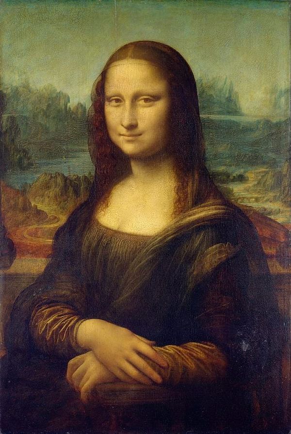
| Oil painting reproduction | Gold, bronze or dark wood, wider profile | Historically consistent, and heavy images can carry heavy mouldings |
| Watercolor, botanical, drawing | Light wood or off-white, narrow | Matches the delicacy of the paper |
| Vintage poster or graphic work | Black, or the darkest color already in the image | Preserves the graphic punch |
| Abstract or contemporary | White or black, as narrow as available | Minimal frames read as a gallery, wide ones as a hotel corridor |
Fine Art America stocks over 250 mouldings in eleven color families — more choice than is useful. Filter by color, then by width, and ignore anything ornate unless the image is genuinely historical.
Choosing the mat color
The short answer is white, off-white or cream, in the overwhelming majority of cases. The mat's job is to give the eye somewhere to rest before it reaches the wall, and a neutral does that without adding an opinion.
Pick the white to match the paper, not the picture. A bright white mat against the warm cream of an old print makes the print look dirty. Cream and antique white sit correctly against aged paper, botanical plates and oil reproductions; bright white belongs with contemporary photography and cool palettes.
Do not pull the mat color from the image. A sage mat because there is sage in the painting is the most common framing error there is: it forces the eye to that one color, it dates quickly, and it stops working the moment the piece moves rooms.
Where color does belong is a double mat. A quarter-inch inner reveal in a color drawn from the image, under a wide neutral outer mat, reads as a considered detail rather than a decorating decision. Black-cored mats do the same job in monochrome.
Black mats close a picture down. Superb around glossy, dark or high-contrast photography; smothering around almost everything else.
One practice worth knowing: traditional framers cut the bottom margin slightly wider than the sides, so the piece does not look bottom-heavy above eye level. Online framers cut even borders. A weighted bottom is a job for a local framer.
When a cheap frame beats an expensive one
Framing hits diminishing returns faster than people expect, and there are cases where the plain option is genuinely better.
On a gallery wall, consistency beats quality. Ten identical inexpensive black frames look considered; ten different good ones look like a junk shop. Buy the plainest frame you like, and buy it repeatedly.
When the image is loud. A saturated abstract or a bold poster gains nothing from an ornate molding — the two compete and both lose.
When the budget is finite. This is the decisive one, and you can prove it on the product page in a minute: configure the same print with a plain molding and a wide mat, then with an upgraded molding and a narrow one. They land in similar territory — but the wide mat visibly changes the piece from six feet away, and the molding upgrade mostly does not.
Where the expensive frame earns it: a single large work in a formal room, where the frame is furniture; an old-master reproduction, where a gold molding supplies context nothing else can; and anything on textured cotton rag, where a thin cheap molding undercuts the paper you paid for.
Glazing, hanging and where the money goes
Glazing. Glass is clearer and scratch-resistant, but heavy and breakable, which is why framers shipping to your door often use acrylic instead. Acrylic is lighter and safer, but it scratches and wants a microfiber cloth rather than a paper towel. Non-glare versions of both exist, trading a slight veil for the loss of reflections. Check which a seller uses before ordering large.
Where the money goes. The print is rarely the expensive part — the molding, mats, glazing and hand assembly are. So the jump from unframed to any framed configuration is much larger than the jump between one molding and another: decide whether you want framing at all before agonising over which frame. And mat width is a cost lever as well as a design one, because every extra inch enlarges the glazing, the backing and the molding with it. Change one variable at a time on the product page and the trade-offs become obvious.
Hanging. Framed prints arrive with wire and hooks fitted. Up to about 24 × 30, one hook into a stud or a rated anchor is fine; above that use two, roughly a third in from each edge. Hang with the center 57 to 60 inches from the floor.
Frequently asked questions
What size mat should I use for a 16 × 20 print?
Two to three inches. That takes the finished piece to roughly 18 × 21 or 20 × 23 before the molding is added, which is the proportion that reads as deliberate. Below 1½ inches a mat looks like a tolerance rather than a choice; above four inches it starts to dominate a print this size.
What color mat should I choose?
White, off-white or cream in almost every case, chosen to match the paper rather than the picture. Bright white suits contemporary photography and cool palettes; cream and antique white suit aged paper, botanical plates and oil reproductions. Avoid pulling an accent color from the image — it forces the eye to that color and dates quickly.
Should the frame match the furniture?
Match it to the room's woodwork and metal fittings instead — door casings, floors, shelves, handles. Those are what the eye compares a frame against, and they do not get replaced every few years. Upholstery is the wrong reference point, and matching a frame to a sofa makes both look like a set.
Do I need a mat at all?
No. Skipping one is legitimate for photography, contemporary work and anything hung in a tight grid. A mat does two things: it gives the eye a rest before the wall, and it holds the print off the glazing so the two cannot stick together. If you skip it, ask the framer how the second point is handled.
What is a double mat and when should I use one?
Two mats stacked, with the inner showing as a narrow reveal — about a quarter of an inch — inside the outer. It is the right place to introduce color from the image, because a sliver reads as a detail rather than a decorating decision. A black-cored inner mat does the same job in monochrome, and suits photography especially well.
Is glass or acrylic better for a framed print?
Acrylic for anything shipped, anything large, and anywhere with children — far lighter, and it does not shatter. Glass for smaller pieces where clarity and scratch resistance matter most. Non-glare versions of both exist, cost more, and trade a slight softening for the loss of reflections.
Every framed print is made to order, so the frame, the mats and their widths are all yours to set — start plain, go wide on the mat, and change one thing at a time. If you would rather skip framing altogether, canvas prints and art prints arrive ready to hang with no mat, no glazing and nothing to decide.