Art for Green and Earth-Toned Rooms
Sage, olive, forest, clay and terracotta each want different art. The palettes that work, the ones that turn a warm room muddy, and why the frame matters more here.

Green and earth-toned walls take art on two relationships. Muted complementary — terracotta, brick, oxblood or dusty rose against green — gives contrast without shouting. Analogous — ochre, mustard, olive and teal — gives depth. What fails in both is cool gray, icy white and pure black, which turn a warm room muddy.
Name your green, or your brown, first
Green spans a wider temperature range than any other wall color. A yellow-leaning olive and a blue-leaning emerald are effectively different schemes, and the same is true across the earth tones: a pink-leaning terracotta behaves nothing like a yellow-leaning ochre.
| Wall | Leans | Pair with | Avoid |
|---|---|---|---|
| Sage | Gray-green, cool | Dusty rose, bone, soft charcoal, pale terracotta | Saturated primaries, orange, gold frames |
| Olive / khaki | Yellow | Rust, cream, oxblood, deep teal, walnut | Lilac, cool gray, silver, mint |
| Forest / hunter | Blue | Brass, gold ochre, ivory, blush, burgundy | Lime, avocado, beige-gray, pale wood |
| Emerald / jewel green | Blue, saturated | Black, white, gold, coral, deep pink | Muddy earth tones, olive, taupe |
| Terracotta / clay | Warm red-orange | Deep green, cream, indigo, umber, black | Bright red, pink, cool gray |
| Ochre / mustard | Warm yellow | Petrol blue, plum, chocolate, off-white | Yellow-based art, lemon, chrome |
| Mushroom / taupe | Neutral warm | Almost anything; needs saturation somewhere | More taupe — the room goes flat |
The quick test: put a scrap of unbleached cream card against the wall. If the wall goes yellow it is a warm green or a true earth tone. If it goes gray-blue it is a cool green and needs cooler, cleaner art.
The two relationships that carry a warm room
Muted complementary. Green sits opposite red on the wheel, but a saturated red in a green room reads as Christmas. Drop the chroma and the relationship still works while the clash disappears: terracotta (#b4552d), brick (#9c4a3a), oxblood (#6b2733) and dusty rose (#c9948c) are all reds with the volume turned down. This is the single most reliable route for sage, olive and forest walls, and it explains why old terracotta-tiled rooms with green shutters look right.
Analogous. Green’s neighbors run from yellow-green through to blue-green, which in practice means ochre and mustard on one side (#c8963e, #d4a02c) and teal and petrol on the other (#2f6f6f). Analogous schemes are quieter than complementary ones and better suited to bedrooms and studies, where you want the wall and the art to settle together.
The neutral that works, and the one that doesn’t. Warm neutrals — bone, ivory, unbleached linen, sepia, umber — belong in this room. Cool neutrals do not. A print with a cool gray ground against olive paint makes both look dirty, because the gray pulls green toward khaki mud.
A useful proportion: let the art carry one warm accent, one neutral and at most one further hue. Earth-toned rooms are already tonally busy, and a five-color print has nowhere to sit.
Green rooms: why botanicals work, and when they don’t
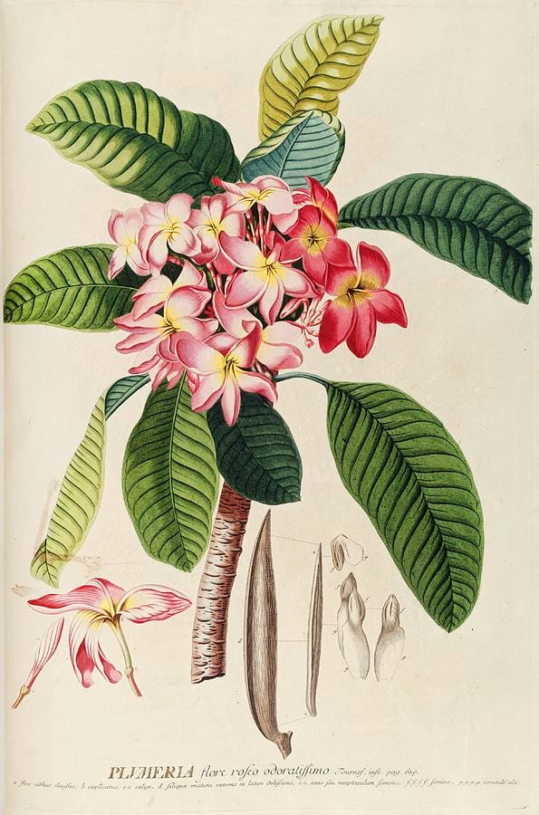
Botanical plates are the default recommendation for green rooms and, unusually, the default is correct — but for a reason worth understanding. Ehret’s plate is not green-on-green. It carries a strong leaf green, a rose-pink complement and, crucially, a large area of warm unbleached paper. That paper ground is doing most of the work: it separates the image from the wall and keeps the whole thing warm.
So the rule is not “buy botanicals”, it is buy botanicals with a warm paper ground. A modern botanical print with a cool white or gray background will sit dead against sage or olive, however good the drawing.
Other subjects that suit green walls: still lifes with copper or brass; landscapes with visible earth and sky rather than all-over foliage; portraits with warm skin tones; abstracts in terracotta and cream; and etchings, whose sepia line is warm.
What to avoid on a green wall: dense all-over foliage photography, which competes rather than contrasts; anything with a lime or mint accent, which fights a mature green; and cool-toned black-and-white photography, which is better served by gray or white walls.
Earth-toned rooms: terracotta, clay and ochre
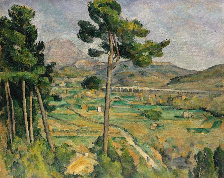
Cézanne’s Provence landscape is a working diagram of an earth-toned scheme. The picture is built almost entirely from ochre, olive, pine green and terracotta, all of them close in value — and then one cool note, the blue-violet mountain, stops the whole thing turning into a single warm blur.
Do the same on a clay or ochre wall. Choose art that shares the wall’s warmth, then insist on one cool element: a slate sky, an indigo shadow, a petrol-blue field, a black frame. Without it, a terracotta room with terracotta art reads as monotone rather than layered.
Specific pairings that hold up: terracotta walls with deep green landscapes; clay walls with indigo or petrol abstracts; ochre walls with plum, aubergine or chocolate-brown work; mushroom walls with anything saturated, because mushroom is the one earth tone that needs the art to supply the color entirely.
Texture substitutes for contrast here: a wood print, or a canvas with visible weave, gives the room variety even when the palette stays narrow.
Frames, mats and the mistakes that recur
Frames. Warm woods first — walnut, oak, cherry, and unfinished ash for lighter greens. Brass and antique gold are excellent on forest and emerald, where the metal reads as a jewel-box accent, but heavy on sage, which is too cool to carry gilt. Black works on emerald and terracotta and is safe everywhere else. Silver and chrome should be avoided across the whole family; cool metal against warm paint looks like an accident.
Mats. Cream, bone or unbleached linen. Never bright white — the contrast is too abrupt against a mid-tone wall, and it makes the paint look dull by comparison.
Recurring mistakes. Matching the art’s green to the wall’s green exactly, which flattens both. Hanging cool-toned gray photography on olive. Using pure black in a room with no other black in it. Choosing a print whose warm colors are a shade lighter than the wall, so the piece looks washed out — earth-toned walls need art with something clearly darker than the paint somewhere in the composition.
Frequently asked questions
What color art goes with green walls?
Muted reds — terracotta, brick, oxblood and dusty rose — give the strongest contrast without clashing, because they are green’s complement with the saturation reduced. Ochre, mustard and teal work as quieter analogous choices. Warm neutrals such as bone, ivory and sepia are the safest option of all; cool grays and bright white are the ones to avoid.
What art goes with sage green walls?
Sage is a cool, gray-leaning green, so it takes softer partners than olive or forest do: dusty rose, bone, pale terracotta and soft charcoal. Botanical plates on warm paper, ink drawings and low-contrast landscapes all suit it. Avoid saturated orange, gilt frames and anything with a lime or mint note, which fights sage rather than supporting it.
Does pink art work in a green room?
Yes, if it is a muted pink. Dusty rose, blush and faded coral are desaturated reds, which makes them green’s complement at a liveable volume. Bright or bubblegum pink is too saturated and will clash. The rule holds across the greens, though pink works most comfortably against sage and forest, less so against yellow-leaning olive.
What art suits terracotta or clay walls?
Art that shares the wall’s warmth but contains one clearly cool element — a deep green landscape, an indigo abstract, a slate-gray sky or a black frame. Without that cool note the room reads as a single warm blur. Cream, umber and black all work as supporting colors; bright red and cool gray do not.
What frame color goes with green walls?
Warm woods — walnut, oak or cherry — are the strongest choice across every green. Brass and antique gold suit forest and emerald, where the metal reads as a jewel-box accent, but are too heavy for cool sage. Black is reliable everywhere. Silver and chrome look wrong against warm paint and are best avoided entirely.
What should I avoid hanging in an earth-toned room?
Anything cool-gray or icy-white, which turns warm paint muddy. Also avoid art that sits at the same lightness as the wall throughout — mid-value art on a mid-value wall disappears. Insist on a genuine dark and a genuine light somewhere in the picture, and avoid matching the art’s color to the wall’s exactly.
For green rooms, start with botanical framed prints on a warm mat, or browse still life and landscape work. For clay and ochre walls, framed prints add the texture the palette wants, and canvas keeps the surface warm where glass would go cold.