Art for a Blue Room
Three color relationships that work on a blue wall, the one that always fails, and the palettes to pair with navy, teal, slate and powder blue.

Art in a blue room should sit in one of three relationships to the wall: tonal (blues from the same family at clearly different values), complementary (amber, terracotta, ochre or rust set against the blue), or warm-neutral (cream, bone, black and warm gray). What fails is the near-miss — a blue of a different temperature to the wall.
Start with the wall, not the art
“Blue” covers colors that behave in opposite ways. A greenish petrol blue and a violet-leaning French blue will accept completely different pictures, so name your blue before you shop for anything.
The test that settles it: hold a sheet of plain cream paper against the wall. If the wall suddenly looks green, you have a green-leaning blue — teal, petrol, denim. If it looks purple, you have a violet-leaning blue — navy, French blue, cornflower. If it just looks gray, you have a slate.
| Your blue | Leans | Pair with | Avoid |
|---|---|---|---|
| Navy / indigo | Violet | Cream, brass, gold ochre, coral, oxblood | Cold white grounds, silver-gray, lavender |
| Petrol / teal | Green | Rust, terracotta, ochre, warm pink, olive | Cornflower, periwinkle, cool pastels |
| Slate / gray-blue | Neutral | Charcoal, bone, sage, soft plum, aged brass | Anything highly saturated; primary red |
| Sky / powder | Cool | Sand, white, tan, dusty coral, pale gray-green | Navy (too big a jump), black-heavy work |
| Cobalt / French blue | Violet | Bright white, lemon, warm orange, black | Teal, muddy earth tones, olive |
Note that a blue wall is never neutral background. It is already one of the loudest colors in the room, which means the art has a smaller job than it would on white: it needs to answer the wall rather than out-shout it.
The three relationships that work
Tonal. Art in the same hue family as the wall, separated by value rather than color. A navy wall with a print whose blues run from pale to near-black reads as depth, not repetition. The rule: at least three clear steps of lightness between the wall and the lightest area of the art, or the piece will disappear.
Complementary. Blue sits opposite orange on the wheel, so amber, terracotta, rust, ochre and warm brown are the natural accents. Used at low volume — perhaps a fifth of the picture surface — a warm accent makes a blue wall look deliberate. Used at half the surface, the two colors fight.
Analogous. Art built from blue’s neighbors: blue-green through blue-violet. Softer than complementary, richer than tonal. This is the safest route in a bedroom, where you want the wall and the art to blur together rather than snap apart.
A fourth option is simply warm neutrals — cream, bone, sepia, black. Technically that is a complementary scheme with the saturation removed, and it is the most forgiving choice of all.
Tonal blue: the safest route, done properly
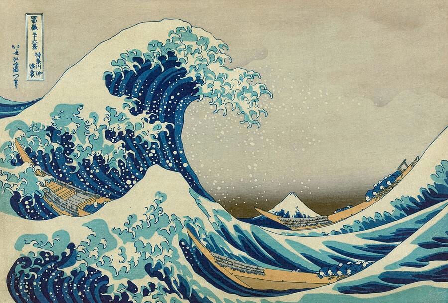
Hokusai’s wave is the model for how to hang blue on blue. The picture is almost entirely Prussian blue, but it runs from near-white foam through mid-blue to an almost black trough, and the sky is a warm putty cream. That cream is what stops the print from sinking into a blue wall — the eye needs one lighter, warmer plane to read the work as separate from the paint behind it.
Apply the same logic to whatever you buy. A tonal blue print needs either a wide warm-white mat, a pale ground within the image, or a light frame. Give it none of those and a beautiful print becomes a smudge from six feet away.
Tonal pairings that hold up on a navy or petrol wall: indigo and bone; Prussian blue and putty; slate and pale eucalyptus; midnight and pewter. Seascapes, night skies, cyanotypes, blueprint-style architectural drawings and ink-wash landscapes are all natively tonal and rarely go wrong.
The complementary route: warmth against blue

Aivazovsky’s sunrise does in one painting what a good blue room does across a wall: it sets a deep blue-green against amber and gold, and lets the warm color occupy roughly a third of the surface. That ratio is the whole trick. Around 70% cool to 30% warm reads as luxurious; a 50/50 split reads as a clash.
Concrete pairings, given as wall then art accent: navy (#1f3149) with gold ochre (#c8963e); petrol (#1f4f52) with rust (#b4552d); denim (#3a5f80) with warm coral (#d97757); slate blue (#5c6b7a) with soft terracotta (#c07a5c).
Subjects that carry warm accents naturally: autumn landscapes, sunset and harbor scenes, still lifes with copper or brass, desert photography, vintage advertising posters, and abstracts with a single warm field. If you want one high-impact piece on a navy wall, a large work with an ochre or rust ground is the most reliable choice there is.
What fails in a blue room — and how to frame what works
The near-miss blue. The single most common mistake. A cornflower print on a teal wall, or a teal print on a navy wall, looks like a color-matching error rather than a decision. Either commit to the same hue family or move a long way from it — the middle distance is where blue schemes die.
Cold whites on a warm blue. Bright white mats and stark white paper grounds go faintly blue-gray against navy and read as clinical. Use an off-white, bone or ivory mat instead.
Lavender, mauve and periwinkle. Too close to blue’s violet edge to contrast, too far to be tonal. They make blue walls look dusty.
Busy multi-color prints. A blue wall has already spent the room’s color budget. Art with five or six competing hues turns the wall into visual noise; restrict a colored piece to two or three hues plus a neutral.
Frames. Warm woods — oak, walnut, natural maple — and brass or antique gold are the strongest choices on blue, because the frame itself becomes the complementary accent. Black works on pale blue and on slate, and is the right answer for photography. Silver and chrome go dead against warm navy; save them for cobalt and true cool blues. Whatever you choose, a mat of 2.5 to 3 inches gives the art its own territory and stops the wall crowding it.
Frequently asked questions
What color art goes with blue walls?
Three families work. Warm complements — amber, ochre, terracotta, rust — give the most contrast. Warm neutrals — cream, bone, sepia and black — are the most forgiving. Tonal blues from the wall’s own family work if they include a clearly lighter, warmer area so the piece does not sink into the paint.
Does blue art work on a blue wall?
Yes, provided it is the same blue family and there is real separation in lightness. Aim for at least three steps of value difference between the wall and the lightest part of the artwork, and give the piece a warm-white mat or a pale ground. A blue print of similar tone to the wall will simply vanish.
What art should I avoid in a blue room?
Avoid near-miss blues — a cornflower or teal that differs from the wall by a small amount reads as a mistake. Also avoid lavender and periwinkle, stark white mats on warm navy, and busy prints with five or six competing colors. A blue wall has already used up the room’s color budget.
How much orange is too much in a blue room?
Roughly 70% cool to 30% warm is the ratio that reads as considered. Let the warm color occupy about a third of the picture surface, or appear as a single accent within an otherwise cool image. When warm and cool approach an even split, the two colors compete and the room feels restless rather than rich.
What frame color works best on a blue wall?
Warm wood — oak, walnut or natural maple — and brass or antique gold, because the frame becomes the complementary accent the scheme needs. Black is right for photography and for pale or slate blues. Silver and chrome look flat against warm navy and are better kept for true cool blues such as cobalt.
What art suits a navy bedroom?
Analogous or tonal work, kept low in contrast: ink-wash landscapes, night skies, botanical studies in muted greens, or soft abstracts in indigo and bone. Bedrooms are the one room where the art should blur into the wall rather than snap away from it, so save high-contrast complementary pieces for living rooms and hallways.
Once you know which of the three relationships you are after, the search gets much simpler. Browse seascapes and blue artwork for tonal schemes, abstracts for a single warm field against the wall, and order in framed prints with a warm-white mat or on canvas if you would rather skip the frame entirely.