Alphonse Mucha’s Ten Most Iconic Posters and Panels
Champagne, cigarette papers, bicycles and the zodiac: the ten designs that turned a Moravian illustrator into the face of Art Nouveau.

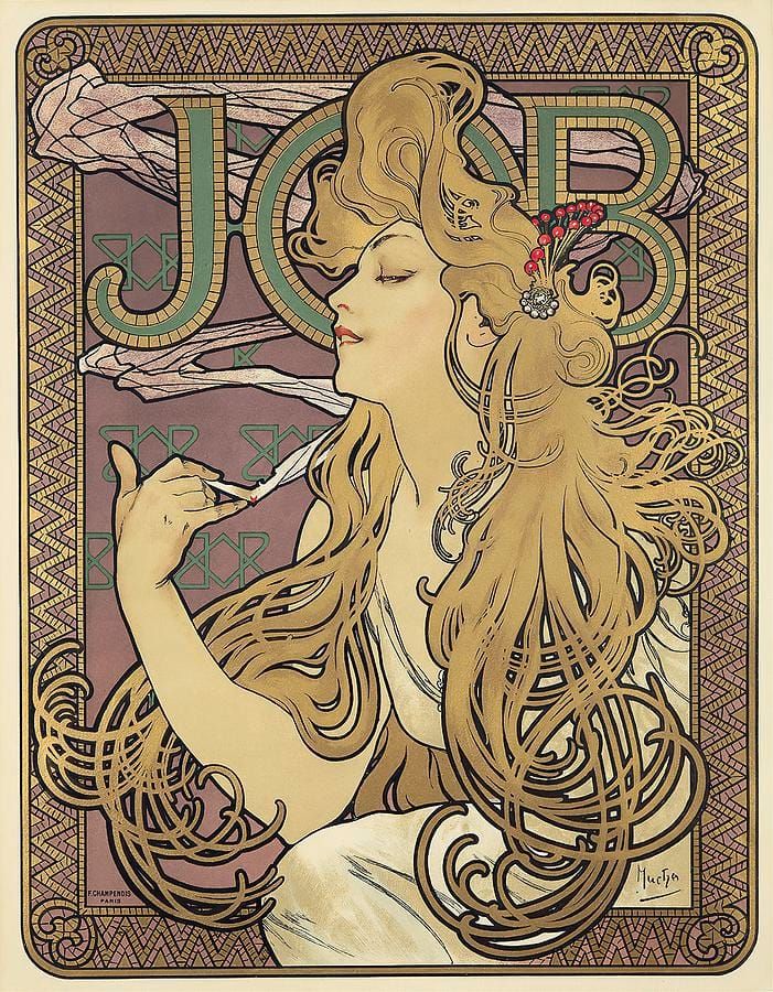
Alphonse Mucha (1860–1939) was born in the Moravian town of Ivančice, painted stage scenery in Vienna, and arrived in Paris in his late twenties as a jobbing illustrator with no particular prospects. Everything changed over the Christmas holiday of 1894, when he was the only artist left in the printing shop and was handed a rush job: a poster for Sarah Bernhardt’s new play, Gismonda. The tall, narrow, pale-gold design that went up on Paris walls in January 1895 looked like nothing else in the city. Bernhardt signed him to a long contract, and within months Parisians were calling the manner “le style Mucha.”
The ingredients rarely changed: a serene young woman, a cascade of curling hair, a halo-like disc behind her head, and a border of flowers, mosaic and lettering drawn with the patience of a medieval manuscript. He applied it to theater bills, cigarette papers, biscuits, beer and bicycles, and to sets of purely decorative panels that people bought simply to pin on a wall — which is why his work has never really stopped being popular. Because Mucha made his name in lithographs rather than easel paintings, this list gathers his ten most iconic posters and printed panels.
Job
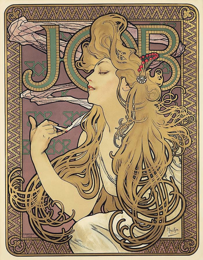
Nothing sums up Mucha better than the poster he made in 1896 for JOB cigarette papers. A woman leans back with her eyes half closed, a thin cigarette between her fingers, while her hair unrolls across the whole sheet in golden spirals that seem to move like smoke. Behind her the letters J-O-B float on a field of tiled monograms, so the brand name is inescapable without ever being shouted. The design was so successful that it was reprinted, imitated and pirated for decades, and it remains the single image most people picture when they hear the phrase Art Nouveau.
La Dame aux Camélias
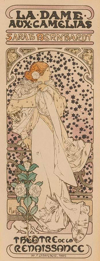
Sarah Bernhardt played Marguerite Gautier in Dumas fils’s La Dame aux Camélias for years, and Mucha’s 1896 poster for her production at the Théâtre de la Renaissance is the most affecting thing he made for her. She stands almost life-size in a trailing white gown against a field of pale stars, one hand at her breast, already looking like a ghost of herself — which is exactly where the story is heading. A single stem of white camellias climbs the left edge. Where his commercial posters shout, this one whispers, and the restraint is why it still works.
Zodiac
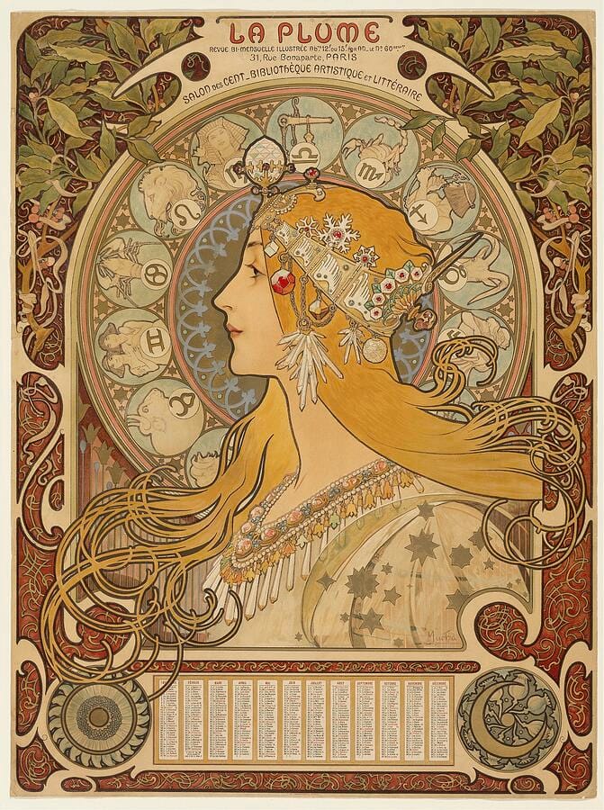
Mucha designed Zodiac in 1896 as an in-house calendar for his printer, F. Champenois. It was so admired that the rights were sold on to the literary magazine La Plume, which issued its own version — the one reproduced here, with the magazine’s name across the top and a calendar grid below. A woman in profile wears a jewelled headdress and diadem; behind her, a great disc carries the twelve signs of the zodiac in their own medallions. It became one of the most reprinted images of the decade, and it shows how completely Mucha could turn a piece of office stationery into an object people wanted to keep.
Bières de la Meuse
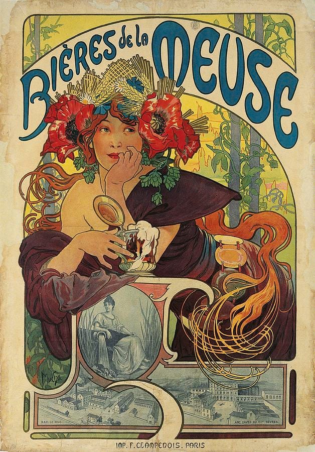
Advertising beer gave Mucha an excuse for one of his warmest designs. In this 1897 poster for the Meuse brewery, a red-haired woman crowned with poppies, hops and ears of barley raises a glass tankard with a head of foam on it, her sleeve slipping off one shoulder and her hair spilling into loops at the edge of the frame. Small engraved vignettes of the company’s breweries sit along the bottom, as though the fantasy figure above were vouching for a real industrial concern. The pairing of a decorative goddess with a factory view is exactly the sort of thing Mucha made look effortless.
Salon des Cent
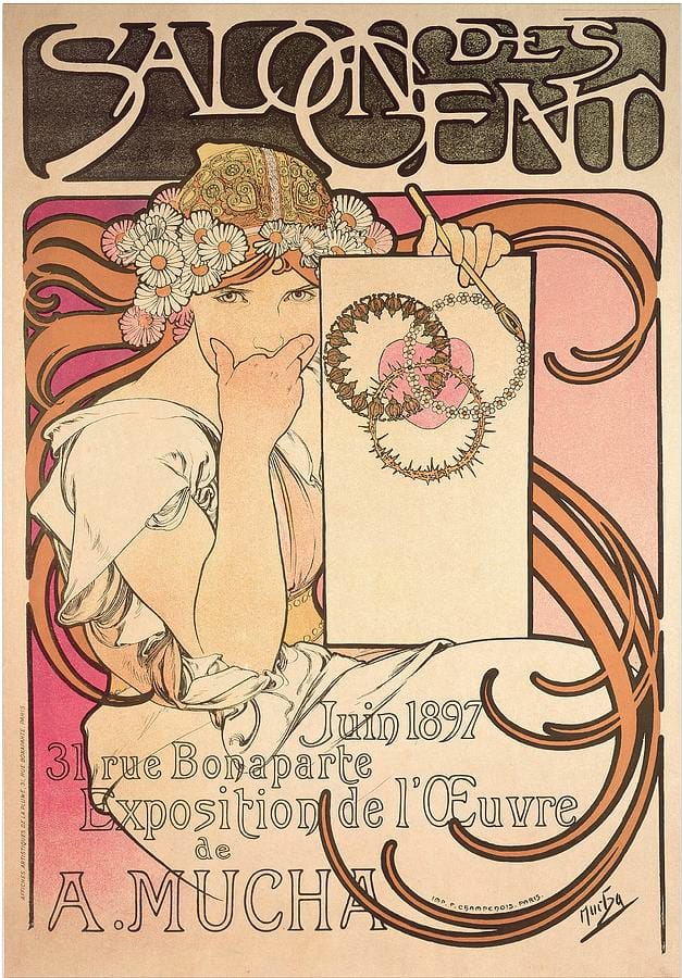
In June 1897 the Salon des Cent gallery on the rue Bonaparte gave Mucha a one-man exhibition, and he designed his own announcement for it. A young woman in a daisy crown and an embroidered gold cap raises a finger to her lips, a quill in her other hand, beside a blank panel bearing a thorny wreath; the hand-lettered title arches across the top in letters that seem to have grown rather than been drawn, and the address and dates are written out below in the same hand. It is Mucha advertising Mucha, and the confidence is entirely earned — the show ran to hundreds of works and cemented his reputation as more than a poster maker for hire.
Moët & Chandon: Crémant Impérial
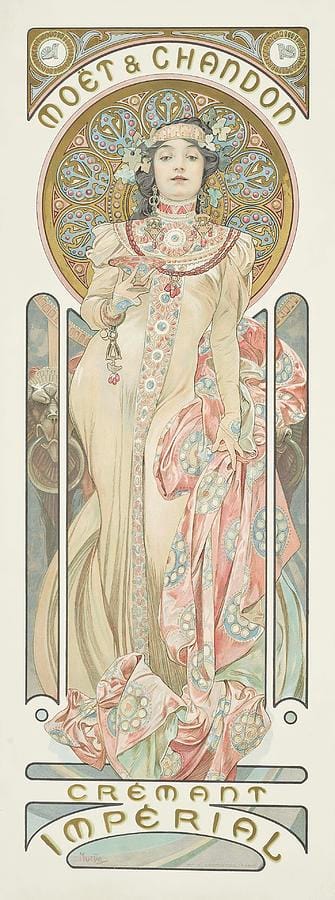
Moët & Chandon commissioned a group of champagne designs from Mucha in 1899, and this tall panel for Crémant Impérial is the most elegant of them. A woman stands full length in a cream gown, a rose-pink mantle pooling around her feet, wearing a collar and headdress of jewelled roundels that Mucha drew with a goldsmith’s attention. The house name curves overhead in his own lettering and the wine’s name anchors the bottom. Champagne advertising had never looked like this before; afterward, for a generation, it looked like little else.
Cycles Waverley
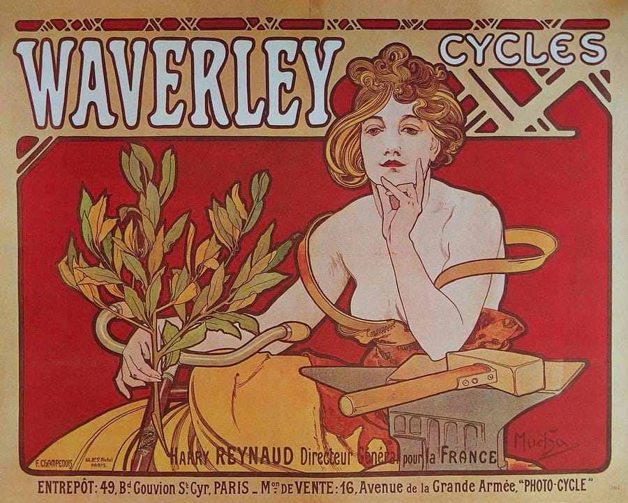
The safety bicycle was the great craze of the 1890s, and in 1898 Mucha made a poster for the Paris agency of the American Waverley firm. A woman in a white blouse and a deep yellow skirt leans on her handlebars against a flat red ground, chin propped on one hand, a branch of laurel spilling across the frame in front of her as though she has just come in from winning something. The brand name is set in tall blue capitals across the top, and the sweep of her arms deliberately echoes the curve of the machine. It is one of his most direct designs — less dreamlike than the decorative panels, and a reminder that his women were often shown doing something thoroughly modern.
Dance (from The Arts)
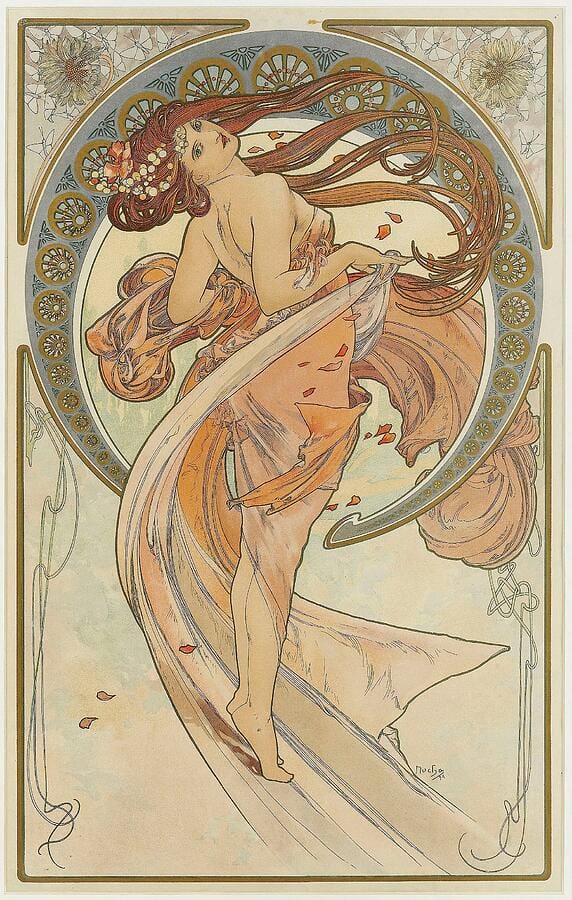
In 1898 Mucha published The Arts, a set of four decorative panels — Dance, Painting, Poetry and Music — with no product to sell and no text beyond the artist’s signature. Dance is the liveliest of the four: a barefoot figure twists away from the viewer with her hair and drapery streaming out behind her, petals scattering across the sheet, a patterned disc behind her head. Panels like these were sold cheaply as lithographs, sometimes mounted on cloth or fitted into screens, and they are how Mucha’s style reached ordinary sitting rooms rather than only the boulevards.
Byzantine Head: The Brunette
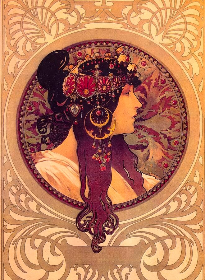
The two Byzantine Heads of 1897 — a blonde and a brunette — are among Mucha’s most concentrated designs. Each shows a woman in strict profile inside a circle, loaded with enamelled disc earrings, a jewelled diadem and coils of hair worked into ornament. The look borrows from Byzantine mosaic and from the enamel work Mucha admired, and it fed directly into the jewelry he later designed with Georges Fouquet. Freed from any advertising copy, the pair are pure pattern, and they have been copied onto everything from tiles to tattoos ever since.
The Precious Stones: Topaz
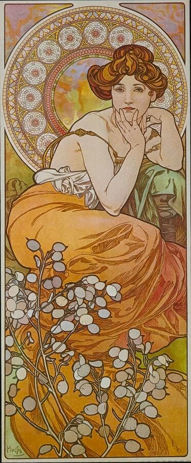
The Precious Stones, published in 1900, is the finest of Mucha’s panel sets: four women standing in for Ruby, Amethyst, Emerald and Topaz, each keyed to the color of her stone. Topaz is the golden one — a honey-haired woman in a heavy amber gown, chin resting on her hand, seated before a rose window of ornament with translucent silvery seed pods spreading across the foreground. Mucha thought in complete decorative schemes rather than single pictures, and the series works best the way it was meant to be seen: side by side, running through the spectrum.
More than a century on, Mucha’s designs remain some of the most companionable art ever made. They were drawn to be lived with rather than studied, they carry color without shouting, and a single panel will hold a hallway or a bedroom wall the way it once held a Paris storefront.
Shop Alphonse Mucha prints here, and explore the rest of our famous paintings collection for more of the world’s most beloved masterpieces.